Pages

Wednesday, September 28, 2011

My new DVD – and a giveaway!


I am pleased to announce that my third DVD with Quilting Arts/Interweave – Dynamic Quilt Design: Paint Meets Stitch — will be available in late October (digital downloads will be available earlier in the month). This DVD focuses on my method of wholecloth painting, in which I start with white PFD (Prepared For Dyeing) fabric and cover the surface with paint before stitching.

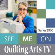
Me on the set of Quilting Arts TV, shooting the DVD
In this 69-minute-long DVD, I teach how to turn your photos into realistic wholecloth
painted quilts. I cover supplies and tools, and how to:
  • choose the right photo
  • trace the design elements
  • enlarge your drawing
  • print it out
  • transfer the lines onto the fabric. 
There’s a bit of basic color theory and information on mixing paint colors, shades and tints. Next, I cover how to approach painting your piece and how to add shadows and highlights for greater realism. And in the last portion, I show how to bring your painted piece to life with thread sketching and quilting. Along the way, I illustrate all these things by showing how I’ve used them in my work.

The focus here is on realistic subjects, so I created the piece below, Still Life With Cherries, to demonstrate the key concepts in the DVD. 

Still Life With Cherries
This is the photo on which the quilt above is based:


I love the combination of paint and stitch! I think the texture that the stitch provides is what makes wholecloth painted quilts so much more interesting than paintings. Here are some detail shots of this small art quilt:

Still Life With Cherries (detail)

Still Life With Cherries (detail)

Still Life With Cherries (detail)

Still Life With Cherries (detail)

I’ve been teaching workshops on wholecloth painting for the past year, and this is really not a difficult technique to master once you have learned the basics. If you can’t get to one of my classes, the DVD gives you what you will need to be successful with the technique. 

The DVD will be available on the Quilting Arts/Interweave website – and on my website – in late October. I’ll keep you posted!

GIVEAWAY! 
To celebrate, I’m giving away one copy of my new DVD! Post a comment after this post, telling me why you would like to win it. At noon on Sunday, October 23, I’ll draw one name at random. I’ll send a copy of the DVD to that winner as soon as I get back from teaching at International Quilt Festival, in early November. If already follow my blog, or if you sign up to follow it now (see the "Join this site" button in the upper right side of my blog, under my photo), tell me that in your post, and I’ll enter your name twice! UPDATE: Bee in Texas is the winner!

Tuesday, September 27, 2011

More Psychedelic Peacock


I have been away for two days speaking and teaching at the Burke Quilters’ Guild in Morganton, NC, about an hour’s drive west of me. What a nice group! And Morganton is a really lovely, interesting town. Before I left, I got a bit more done on my peacock – especially on his head – so I thought I would share it with you. I’m hoping to do a lot more work on it in the next few days. 


I am pleased with what I’ve done so far on his head. It is funny that when I crop it this way, he looks pretty reptilian, doesn’t he? Peacocks have small, rounded, short feathers on their heads, and longer, stringier feathers on their necks. I tried to imitate this with my thread sketching.


I am taking artistic license with the feather strands, and making them much curlier at the top than they are in real life. 


Where the strands cross each other, it creates really wonderful grid patterns.


Thursday, September 22, 2011

Thread sketching Psychedelic Peacock


I have started thread sketching Psychedelic Peacock. It is going to take a long time! I am liking how the thread looks in the areas where the strands of feather overlap each other.


Right now, I am not sure if the thread is showing up as much as it needs to. I use a light-weight cotton thread (my favorite, Aurifil Cotton Mako 50) when I thread sketch. Heavier thread would cause too much draw up, as I am only working through the top of the quilt and a layer of interfacing. 

Of course, there will be more thread – and heavier thread – added when I quilt, but I had not intended to go over all these lines again. Perhaps I will quilt in between the existing lines on the feathers, using a similar color of thread. But that would be a heck of a lot of quilting! 

I am considering using some metallic paint around the eyes on the feathers – and maybe just a little on all of the feather parts – to add some shimmer or iridescence. That would be done after thread sketching and quilting, which is a little scary… it would be horrible to spill paint on a nearly finished piece. 
 
I also think I need to work on covering the spines of the feathers a bit more – either with thread or with paint – as they are too dominant against the black background.  

Here is a detail of the small feathers on the sides of the peacock’s neck:

Wednesday, September 21, 2011

Meadowood Stitched is Oct. 1 through Nov. 14


You are invited! Please mark your calendars and make plans to visit our latest exhibition, Meadowood Stitched, at Daniel Stowe Botanical Garden in Belmont, NC, just outside Charlotte. It runs October 1 through November 14. 

“Meadowood Stitched” is an exhibition of work by Fiber Art Options, a group of fiber artists from the Charlotte area who work in fabric, paper, fiber and thread.  This exhibition celebrates the opening of Meadowood Walk, the newest part of Daniel Stowe Botanical Garden, through an exploration of the colors, textures and intricacies of meadow and woodland plants, animals and insects. 

During the past year, members took hundreds of photos in the meadows and woodlands of Daniel Stowe Botanical Garden, and in other meadows closer to their homes, and used these photos as inspiration for their work. Each piece reflects the myriad perspectives possible in a natural landscape combined with the unique style and methods of each artist. 

The exhibition will include the work of Nancy G. Cook, Linda Stegall, Deborah M. Langsam, P.J. Howard, DeLane Rosenau, Janet A. Lasher. And me!

Tuesday, September 20, 2011

Psychedelic Peacock

Okay, after about three full days of work, pretty much non-stop (when I wasn’t cooking, cleaning, doing laundry, driving kids around, walking the dog, or sleeping), here’s where I stand on Psychedelic Peacock. All the planning, drawing, tracing, cutting and fusing are done! It is ready to thread sketch! Well, after I get the stabilizer ready.


In the shot above, you are only seeing the middle section (about 36" in depth, since that's the width of my work table). The shot below shows a bit more of the bottom. I know that the spines look really strong right now because they are so light in value, and the background is black. But they will get partially covered up with a lot of brightly colored thread, so I think they will recede significantly in the next step.

I am liking it a lot, and I usually end up liking my pieces much more when I’ve done a lot of free-motion stitching on them, so I’m excited to move on to the next step. But it may be challenging, because I don’t have a long-arm or mid-arm machine and this is a big piece (48" square), and it is pretty stiff, due to the fact that there are large areas of fusible adhesive in it, and there will be interfacing behind the whole thing.  Wish me luck!

I actually made it about 52" square to start. The heavy thread sketching I do tends to shrink pieces up a bit, and I can always crop it down a few inches at the end, if need be. 

Monday, September 19, 2011

Psychedelic Peacock, Part 2


I spent all day today (a good 8 hours) working on Psychedelic Peacock, and I am liking how he looks. The photo above shows the top portion of what will be a 48" square piece. I will add a lot more detail on the face and beak when I thread sketch this piece. Right now, he looks pretty flat, but he definitely has that look in his eye that says, “Watch out!” The same look he had before he chased me off the lawn!


The colors really pop against the black background, don't they? Tomorrow I will take on all the “spines” of the individual feathers, and all those little fluffy feathers on either side of his neck. There are probably more than a hundred of them. And once I get more of the two blue fabrics, I will finish up his neck. Then I have a huge amount of stitching to do!

Sunday, September 18, 2011

Psychedelic Peacock


This weekend, I got started on my latest piece, which will be pretty large, about 48" square. The sketch above shows what I’m aiming for (except that the background will be black instead of white). I’m going to do it in a pretty realistic way, but change a lot of the original colors.

The piece is based on the photo below, which I took at the zoo in Colorado Springs this summer while on our family vacation. This peacock was uncaged, strolling the lawn, and was initially quite happy to have his photo taken. I was pretty close to him, maybe about six feet away, when he decided that he didn’t like me much. He hissed, and came at me, and I retreated … but not before getting some great shots.


I started by cropping my photo to a square and printing it out 8" wide on my laser printer. After tracing the main lines in the image on tracing paper, I blew up the line drawing in Photoshop to the 48" size I needed. Then I placed this image in InDesign, a page layout program, and drew dotted lines every 8" across and 13.5" down (as the pages would be printed out on 8.5" x 14" legal-size paper). I positioned the sections, one at a time, on the page, and printed each out – a total of 28 sheets. Then I cut and taped them together along the dotted lines. You can see the dotted lines here if you look closely:


Here’s how it looked all together on the work table in my studio:


I placed black fabric on top of this drawing, pinned it to the paper, then positioned a light box underneath, and slid it from section to section, roughly drawing the lines with a mechanical chalk pencil. These lines will help me position the fabric pieces, after I’ve put fusible adhesive on the back of each.


Usually, I trace my lines onto clear upholstery vinyl, and use that as a positioning overlay to place all the fabric pieces correctly. In this case, since the piece is so big, I thought a vinyl overlay might be difficult to use, so I am trying this instead. 

Next, I needed to plan how I would color the drawing, since I’m not doing this in the actual peacock colors in my photo. My peacock is going to be kind of technicolor! So I took a copy of my line drawing, and had some fun with my watercolors. (The finished painting is at the top of this post.)


My next step will be to start tracing shapes onto my fusible adhesive. I use Lite Steam-a-Seam 2 from The Warm Company, because it works great for my process. Because it is slightly sticky after you remove the paper backing, it is very easy to position and reposition all the little pieces before you fuse them down. Sometimes I have a lot of little pieces, so this is an important feature for me. I also like the stability that the adhesive provides. Lite Steam-a-Seam 2 is not the lightest fusible adhesive out there – this is a plus if you are going to do a lot of threadwork on top of a piece, because it acts as a stabilizer, too. I will be using interfacing behind this piece to provide additional stability before I stitch; I’m doing all the little strands in the feathers with thread sketching.

By the way, my interest in peafowl goes back to the early 1990s, when my husband and I rented a late 1700s cottage on the Shadwell Estate. Shadwell is the land originally owned by Thomas Jefferson’s father, and where Jefferson grew up, just outside Charlottesville, Virginia. Our landlord lived in a spectacular mansion built by Jefferson’s grandaughter, and we lived in the older, smaller house, which we called Boxbriar Cottage. It was the most amazing place I have ever lived, surrounded by 20-foot-tall boxwoods, pastures, gardens, enormous tulip poplars, and woods. 

Our landlords had peafowl; not long before we moved in, their peacock had been killed by an owl. His mate, peahen Emily, still sauntered the grounds, and we loved seeing her and hearing her eerie cat-like call in the evenings. When our landlords went out of town, we were given the job of feeding Emily, who ate quartered grapes, chopped walnuts and crushed Carr’s Water Crackers. I am not kidding you.

Saturday, September 17, 2011

Journal-making class with K. Grace Howes


Today, I took a journal-making class with my friend, K. Grace Howes of Redbarn Studios. It always find it fun – and liberating – to take a class in something I’ve never done before; this was a perfect example. Using Grace’s design for her “Coptic Stitch Journal,” I learned how to cover chipboard with fabric and paper for the covers, how to create signatures of paper for the inside, and how to stitch the whole thing together. 

Grace demonstrates one of the techniques.
Barbara stitches her journal together.
Elyse pulls her waxed linen thread through the binding.
Grace shows us how to do one of the trickier parts of the project.
The front of my journal is shibori fabric I made several years ago by stitching with a running stitch into white cotton fabric, pulling the thread very tight so that the fabric bunched up, knotting it, and then dropping the fabric in a vat a black dye. I think it looks like dental x-rays!

The front cover of my journal.
The inside of the front cover is a sparkly glitter paper:

The inside cover of my journal
I chose a Halloween theme for my journal. Don’t you just love that spiderweb paper (below)? These special papers separate the signatures, or folded bunches of paper inside the journal.


In this photo showing an overhead view, you can clearly see the four signatures:


Stitching the signatures and the book covers together with the waxed Irish linen was the trickiest part. Here’s how the side of my journal looks. I’m not sure that I did everything exactly right, but it looks pretty much okay!

I will probably do some embellishment on the front cover, but I’m going to let my ideas percolate for a while before I do. What a nice way to spend a Saturday morning!

Friday, September 16, 2011

Meet Edyta Sitar, Aurifil’s designer of the month

Edyta Sitar
Aurifil’s Designer of the Month for September is Edyta Sitar of Laundry Basket Quilts. As you know, I love and make traditional quilts as well as art quilts. Edyta does, too! In her traditional quilts, she often combines applique with piecing, and her color schemes — usually warm and soft — are just luscious. Look at this beauty:

“Reaching Out” by Edyta Sitar
Her art quilts are very graphic, and usually feature batik and hand-dyed fabrics. Here is one of her patterns:


Pat Sloan interviewed Edyta on the Aurifil blog; you can also download the lovely free project she designed there. Here it is:

If you want to hear Pat’s interview with Edyta on May 2, 2011, click here.  

Remember, if you make any project from the design team, load a photo to our Aurifil Flickr group. This puts you in the running to win an Aurifil thread prize!


You can check out Edyta’s books, calendars, patterns and fabrics in her online shop. Here is her latest book:


GIVEAWAY!
Each month this year, I’m going to be giving away a pack of Aurifil minispools (like the one shown above) when the new project is announced. Just leave a comment after this post telling me how you learned to quilt (did someone special teach you, or did you take a class? read a book?).
I'll pull a name at random on Saturday, October 8 at noon EST. The sampler pack (below) includes great colors in different weights. We have a winner! BillieBee from Texas won the thread this month.


Tuesday, September 13, 2011

Two butterfly pieces are done!


This morning, I finished stitching the facing on two butterfly quilts, and then photographed them. Up and Away! (above) is a piece for an exhibition by Fiber Art Options that opens at Daniel Stowe Botanical Garden on October 1. You can read about how I made it in previous posts. Here are some detail shots:


I used heavy carpet thread for the antennae. Even though I waxed it the thread, they are still flopping around a bit. I may need to replace them with wire. Ideas, anyone?


I love how the stitching accentuates the grass. 


I had a lot of fun quilting the sky. I wanted it to look like air currents. 


This piece is Little Green Butterfly. I made this piece for a Silent Auction this fall to benefit the International Quilt Association. It is a tiny thing, 7.75" x 6"; I hope it doesn’t look too pitiful when displayed with the other small quilts. I think they were all supposed to be little, less than 24" or so. But I think it would be beautiful stitched to a mat and framed. Here is a detail:


Sometimes when I take photographs, or when I am stitching the little details in my work, I am filled with amazement at the intricacies of nature, the miracles of the little things. I am reminded of this quote:

“God is in the details.” – Mies van der Rohe 

Monday, September 12, 2011

Quilting “Up and Away!”


Here’s where my new piece, Up and Away!, stands now. Last night I added the purpley-blue at the top, since the piece was looking flat to me. I think it has a lot more magic in it now. Funny how one change like that can make such a big difference. I also went back in and re-painted some of the grass with more saturated color, and I like the way some strands look hazy, like they are out of focus in the background. This helped to add some depth, too.

The placement of the butterfly is not exact; I just plunked it down there for the photo. (It is already stitched and ready to position once I have quilted the sky). That is next.

Sunday, September 11, 2011

Up and Away!


For the past two days, I’ve been painting grass. Lots and lots of grass. It is for a new piece I’m doing for an exhibition called “Meadowood Stitched” by Fiber Art Options at Daniel Stowe Botanical Garden that opens October 1.


I used lots of muted shades of green and brown, working from a traced line drawing underneath PFD (Prepared For Dyeing) fabric. I added additional strands of grass to make it a little more full and lush.  

This is the first time I’ve used PROfab Textile Paints in a wholecloth painted piece, and I must say that I am extremely happy with the results. I used the Transparent paints. They were a nice, consistent texture, even the white and black, which can be lumpy in other brands. The containers are very easy to use, and the paint pours nicely from them. The shape makes it easy to get the last little bit of paint out.

I have never used extenders much before, but I played with them a bit this time, and found they did a good job of keeping the paints from drying out as I worked. (And since I painted over several days this weekend, that was important.) If you use a lot of the extender, you get a paler color; I just used a bit. Using a plastic palette with multiple compartments and a snap-on lid helped, too. You can see this palette in the first photo.

When it came time for the background, which I wanted to look like blue sky, I added Paint Thinner to the shade of blue I had mixed. I sponged it over the entire surface, and rubbed it in with my hand and a sponge. This had the effect of muting the grass colors down a bit, which was initially a little scary, but I like the results. When I was done, this is how the 24" x 36" piece looked:


For this exhibition, the pieces have to be either 24" x 36", or 24" square. Initially, I had envisioned the piece in the vertical format. But once I put the butterfly down, I wasn’t liking it so much. (I had already constructed the butterfly; it is three-dimensional, and will be positioned on the piece after I finish and quilt the background.) There was too much “negative space” (the blue sky), and the butterfly seemed to small:


What to do, what to do? I played with the idea of adding some taller strands of grass, or some some other plant stalks. I had taken some photos of the meadow with these kinds of stalks, and thought this might work. I also considered adding a line of trees in the background, but I really wanted the piece to emphasize the flight of the butterfly, and thought these options might be distracting. Right now, I am playing with something like this, in the square format, with part of one wing extending out beyond the edge:


I’m thinking about calling this piece Up and Away! I am going to go back in and paint some of the grass strands in the foreground a bit darker and more saturated color, leaving the strands in the background more muted, as if they were out of focus in the photo. Right now the butterfly is standing out a bit too much, and I think it is because the values are stronger in the butterfly than they are in the grass.

On the Pro Chemical and Dye website, here are today’s prices for the products I mentioned in this post:
PROfab Transparent Textile Paint: $2.35 for 3 oz., $5.50 for 8 oz.
PROfab Transparent Base Extender: $4.95 for 8 oz.
PROfab Paint Thinner: $2.25 for 8 oz.

This is cheaper than the Jacquard Textile Color I’ve been using, and the consistency of the white and black is much better.